
Overview
Eataly is an Italian gourmet market that has twenty-five speciality locations throughout the world. Their Brick and mortar stores are laid out like a traditional Italian market, offering some of the finest produce, cheeses, meats, and more. Eataly's in store experience and customer base continues to grow. However, that same atmosphere and empathetic approach doesn't have that same consistent feel on their website.
My Role
Independent UX Researcher, Independent UIDesigner
Duration
2 Weeks
Deliverables
User Interview, Contextual Inquiry, Comparative & Competitive Research, Heuristic Analysis, User Flow, Usability Testings, Sketches, Wireframes, Animated Prototype, Presentation
Tools
Sketch, Trello, Keynote, In-Vision, Whiteboard, Pen, Paper, Post it, Omnigraffle
Initial Problem Statement
Eataly’s current website makes it difficult for user to navigate, search, and easily purchase/check out items. How might we create a user friendly experience while navigating the E-commerce website?
Research Tools
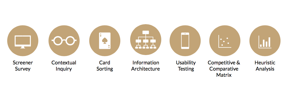
Research Phase 1
Contextual Inquiry
In order to understand shopping habits and decision a contextual inquiry was conducted. The Flatiron location in NYC provided the ability to follow/listen to customers interactions and an understanding of the stores layout. It also presented the opportunity to speak with associates and clientele.
Research Phase 2
Screener Survey

Research Phase 3
Affinity Map

Personas
Two personas were created from our affinity map insights and contextual inquiry. Chelsea a busy school teacher who likes to entertain was our primary persona.

Information Architecture
To better understand Eataly's current site structure and experience more we used the following tools:

Card Sorting
Six rounds of card sorting was conducted to identify pain points customers ran into while navigating products/categories. This gave the ability to get a better understanding of Eataly's IA. A total of 100 products across all categories were represented in two closed rounds, and four open rounds of testing.

Revised Problem Statement
Eataly's customers enjoy the personalized in-store experience that provides in-depth product knowledge and well trained staff. How might re-create that atmosphere for customers shopping on-line.
Design Tools
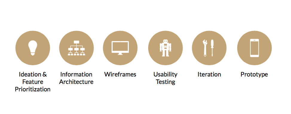
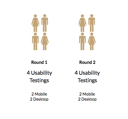
Usability Testing
Design Revolution

Landing Page

Product/Inventory Page

Check Out Process

Navigation(drop down)

Shopping Bag/Check Out